Hullo,
I don't know exactly what a banner does, but from an aesthetic point of view...
Maybe make "Forever" bigger since it is our band name... slightly transparent and overlapping the other characters might be cool.
Also, no offense to any typesetters out there, but to me that cursive is kind of cheezy. I think sororities use it to write girly stuff.

Do we even need to have the English translations to the other characters?
... pondering...
If I were fiddling, this is what I would do:
Make the other characters bigger and more centered. Delete the meanings.
Make the characters for "Forever" overlap almost the entire screen and translucent.
Write "FOREVER" really long and narrow across the middle. Like this" ---FOREVER---" (except for without the space between dashes)
But really since I have no inclination to do all the work and set up the stuff, it may not look as good in reality as it does in my head. Maybe later over the summer when I have more time.
Totally your own interpretation. Feel free to disregard.
Cool idea though. Are those symbols two different kanjis for the same word?
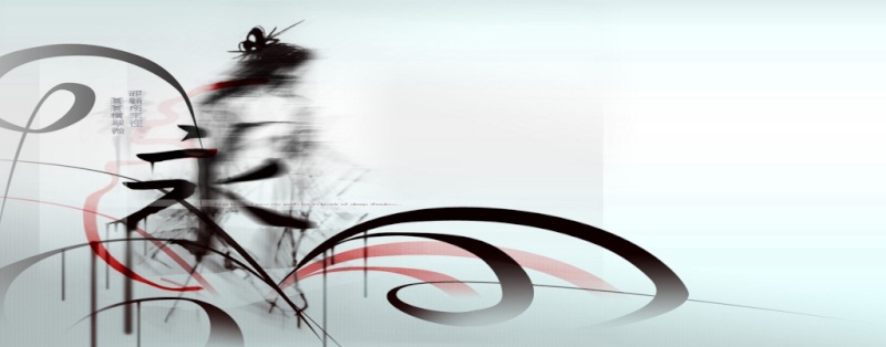


 was trying to come up with a symbols for the Guild but couldn't come up with one right now but i just got a Animation program what ill be playing with for sometime and trying out new things for the banner all i need is sometime and a little help because over time ill come up with a kick ass Symbol for the Guild. DoveSong Feel Free to use this one if you plz but do remember ill be still working on it to make it allot better. I'm going to be trying to make it Animated cherry blossoms Falling or a Snow storm as of right now the next banner is in the works ill give you the heads up on how its going